DSPACE/Plots
This is a working draft of a page of instructions on how to add a plot to a ControlDesk layout.
Contents
Process
Add Instruments
In order to view and manipulate a plot, you will need to add two components from the instrument selector - specifically from the Data Acquisition section. Activate that group of instruments within the instrument selector, then select and draw
- A CaptureSettings box - this will need to be fairly large
- A PlotterArray box - this will hold your plot, so make it as large as you want your plot.
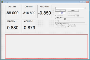
At right is an example of a layout with five displays, a CaptureSettings box, and a PlotterArray box.
Configure CaptureSettings Block
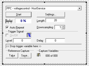
The CaptureSettings box needs to know from where the captured settings are coming. While in edit mode, the CaptureSettings box itself will be fairly inactive. To make changes, you will either need to double-click it or be in animation mode. Assuming you stay in edit mode, double-click the CaptureSettings box. Select the Capture tab and in the pull-down labeled Capture, select PPC - NAME - HostService where NAME will be the name of the SDF used in the layout. Click Apply and OK. The CaptureSettings window should now resemble the one at right.
Configure PlotterArray Block
The PlotterArray block is extremely versatile, and this tutorial will not be going into all the various ways to configure it. Instead, this will cover how to add a single plot that tracks two different variables. With the layout in Edit mode, double-click inside the PlotterArray block, then push the Plotter button inside the Add Instrument section. A Plotter window should now be inside the PlotterArray.
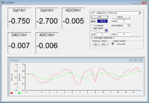
To tell the plotter what to actually plot, you will need to drag plottable variables from the SDF tab at the bottom of the window onto the Plotter. If you drag more than one variable onto the Plotter, it will generate a y axis for each. In the example at right, variables ADC1/In1 and ADC5/In1 were dragged into the Plotter window. ControlDesk will automatically assign them different colors, though you can change them later if you like.
Further Customization
At this stage, if you animate the layout you will end up getting a plot of the two variables. Generally, however, you will want to configure the CaptureSettings and the Plotter a bit more. Specifically, you will want to tell the CaptureSettings how much data to take and you probably want to firmly establish the y-axis limits for the Plotter. For the first part, in the CapturedSettings window, simply change the number in the Length box. Note that if the animation is running, you will need to hit the Stop and Start buttons in the CapturedSettings box to have your change take effect (or wait for the current length of data to be taken).
For the y-axis settings, right-click on the Plotter and select Plotter Properties. You can then select the Y-Axis tab. In that tab, you will notice an Axis: pulldown box -- you can individually set the axes for each of the variables you are plotting.
- To make sure that your values stick, first click the Fixed option in the Scaling Mode box
- Now type in your limits for the first variable and click Apply
- Use the Axis: pulldown to choose the next axis and repeat steps 1 and 2 above for all your y axes.
- Click OK
Your plot should now have fixed axes and should take data sets over a duration of time as specified by the Length box in the CapturedSettings block. The image at right demonstrates what the layout might look like for plotting two variables over a span of 15 seconds with \(\pm\)1 V as the y-axis limits. Note that the "Auto Repeat" button in the CapturedSettings box had been turned off to allow for a screen capture after one full data run.-


